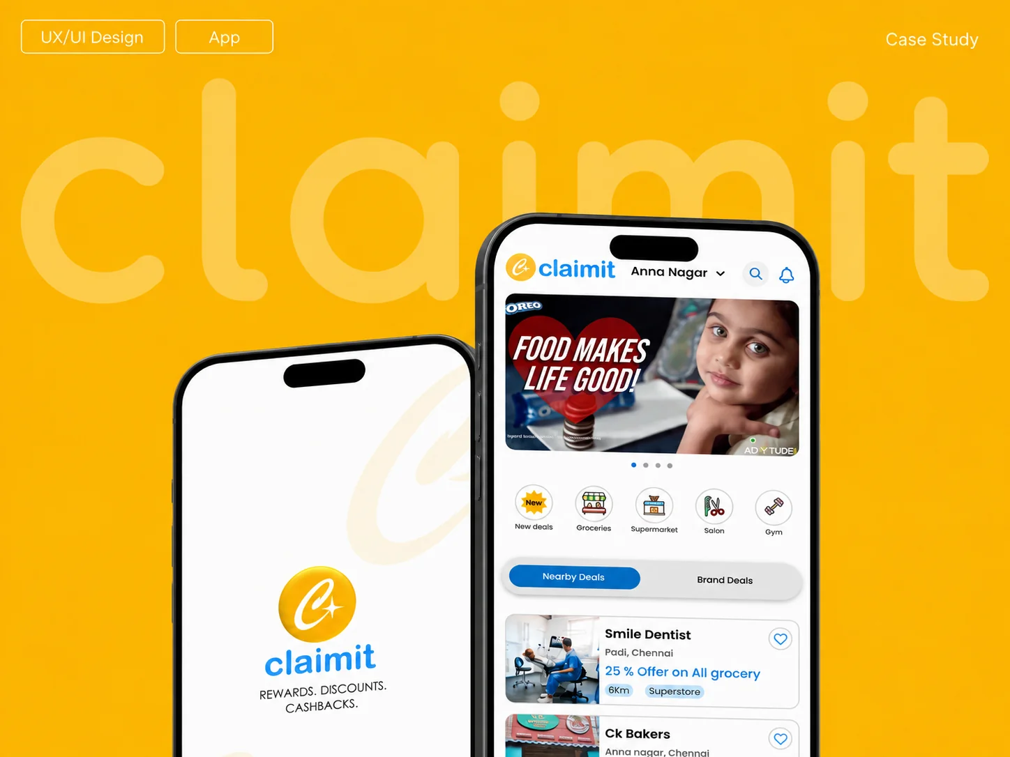
Claimit turns everyday spending into everyday savings.
Claimit is a hyper-local rewards platform where customers discover nearby businesses, scan bills, earn reward points, receive cashback, and use points as discounts on future purchases.
100%Reward point value on eligible bills
1%Cashback credited to wallet
5 kmHyper-local offer radius
FreeDownload, join, earn, and save
Project Goals
Make “Shop → Scan → Earn → Enjoy” simple to understand.
The design goal was to make Claimit’s reward journey feel clear, trustworthy, and repeatable for customers while supporting local business discovery.
01
Explain the value fast
Communicate rewards, discounts, and 1% cashback without confusion.
02
Guide the core habit
Help users shop normally, scan bills, earn points, and redeem later.
03
Improve local discovery
Surface nearby deals, brand deals, promo content, and local services.
04
Support both zones
Make Reward Zone earning and Redeem Zone discounts easy to compare.
Requirements Gathering
Requirement gathering from the Product Owner.
Product Owner Workshop
Business requirements were translated into UX priorities.
We began by understanding the product vision, business objectives, target users, expected outcomes, and operational context before moving into research and design.
Outcome
Shared product understanding and a clear direction for UX research, flows, and design decisions.
01
Product vision
Business goals and expected value.
02
Primary users
User needs, roles, and motivations.
03
Core features
Priority modules and must-have actions.
04
Customer journey
Business workflow and user touchpoints.
05
Constraints
Technical and operational boundaries.
06
Success metrics
Expected outcomes and measurement points.
07
Assumptions
Dependencies and possible edge cases.
08
UX direction
Research questions and design priorities.
Competitor Analysis, Gap Analysis & Edge Cases
ClaimIt’s edge is offline, hyper-local value.
Capability
Magicpin
CashKaro
CRED
PhonePe
ClaimIt
Local discovery
Yes
Limited
No
Limited
Yes
Offline rewards
Yes
No
Limited
Yes
Yes
Online offers
Yes
Yes
Yes
Yes
Selective
Gaps identified
Unclear point value
Fragmented loyalty apps
Slow confirmation
Low redemption trust
Edge cases covered
Expired offer
Rejected submission
Location mismatch
Pending review
User Pain Points & Solutions
Each frustration maps to a clear product response.
User Pain Points
Our Solutions
P1
Hard to Find Relevant Deals
Useful nearby offers are difficult to discover.
→S1
Personalized Local Deals
Offers reflect location, interests, and preferences.
P2
Complicated Redemption
Unclear steps make rewards difficult to use.
→S2
Instant, Easy Redemption
Simple steps create a hassle-free experience.
P3
Rewards Take Too Long
Users wait too long for points or cashback.
→S3
Quick Rewards & Cashback
Approved value appears clearly in the wallet.
P4
Irrelevant Notifications
Too many alerts reduce attention and trust.
→S4
Smart, Relevant Alerts
Users see timely updates for offers they value.
User Groups
Four audiences shaped the experience.
01
Budget Shoppers
Students and young adults looking for deals, cashback, and smarter daily spending.
Price-sensitive
Actively compares offers
Loves instant rewards
02
Frequent Consumers
People who spend regularly on groceries, dining, and essentials and expect value every time.
Routine spending
Values convenience
Wants clear savings
03
Local Explorers
Users who enjoy discovering nearby cafés, stores, and hidden local deals.
Explores new places
Interested in hyper-local offers
Engages with nearby brands
04
Merchants
Local shop owners who want repeat customers, simple campaigns, and better visibility.
Runs local promotions
Needs simple tools
Tracks customer engagement
User Personas
Customer personas
I love finding good deals and getting cashback on everyday spending.
Priya Sharma
23 · College Student · Chennai
StudentRole
Mobile FirstBehavior
Budget ConsciousMindset
Goals
Find nearby deals
Redeem rewards fast
Maximize everyday savings
Redeem rewards quickly
Pain Points
Too many reward apps
Hidden offer rules
Slow cashback confirmation
Low trust in new platforms
About
Student shopper looking for clear, useful savings on daily spending.
I want to support local businesses and get rewarded for everyday purchases.
Rohan Mehta
34 · Young Professional · Chennai
ProfessionalRole
Regular ConsumerBehavior
Local ExplorerMindset
Goals
Earn on daily spend
Find local offers
Discover nearby offers
Support local merchants
Pain Points
Multiple loyalty apps
Unclear redemption
Rewards arrive too slowly
Limited nearby offers
About
Regular shopper who wants simple local rewards and quick redemption.
User Personas
Merchant personas
I want an easy way to attract more customers and reward them without raising my costs.
Arun Kumar
35 · Shop Merchant · Chennai
Kirana StoreShop Type
ChennaiLocation
8 YearsExperience
Goals
Increase repeat customers
Create simple offers
Build customer loyalty
Track offer performance
Pain Points
Hard to stand out
High ad cost
Little time for promotions
No redemption insights
About
Local merchant who needs simple promotions without extra complexity.
I want to grow my business locally and build strong customer relationships.
Neha Sharma
32 · Local Business Owner · Chennai
CaféBusiness Type
ChennaiLocation
6 YearsExperience
Goals
Increase local visibility
Retain customers
Run reward campaigns
Understand customer behavior
Pain Points
Limited budget
Finding local audiences
Manual, slow processes
No data to improve offers
About
Café owner who wants simple campaigns and stronger local loyalty.
Card Sorting
The product follows a familiar mental model.
We used card sorting to shape navigation around the way people naturally understand ClaimIt.
Why card sorting?
ClaimIt combines deals, rewards, redemption, wallet activity, notifications, and account tools. Card sorting helped us understand how users naturally group this content and which labels felt clearest before finalizing the navigation.
How we conducted it
We conducted card-sorting sessions with real users from the key audience groups. Participants organized feature cards into categories, named the groups in their own words, and explained where they expected to find each function.
What we learned
Users consistently separated discovery, reward activity, notifications, and profile settings. These patterns directly informed the final information architecture.
01Discovery
Nearby Deals
Brand Deals
Categories
Search
02Rewards
Scan Bill
Bill Reader
Reward Success
Cash Wallet
03Redeem
Redeem Zone
Offer Details
Confirm Redeem
Discount Applied
04Account
Profile
History
Favourites
Settings
User Flow
Three clear journeys drive ClaimIt.
Each path keeps the next action visible and moves users quickly toward a meaningful outcome.
♢
1. Earn Rewards
User scans a bill and earns reward points and cashback.
⌂Home
→
⌗Bill Scanner
→
▤Scan Bill
→
▧Bill Reader
→
✓Reward Success
→
▣Points & Cashback Added
◇
2. Redeem Points
User redeems points as an instant discount.
▦Main Menu
→
◇Redeem
→
⌂Select Shop (Redeem Zone)
→
◇View Offer & Points Required
→
✓Confirm & Redeem
→
▱Discount Applied at Checkout
●
3. Discover Deals
User finds and explores nearby deals and offers.
⌂Home
→
⌖Nearby Deals
→
⌂Browse Shops & Offers
→
ⓘShop Details Page
→
◇View Offer Details
→
♢Visit Shop & Earn Rewards
Information Architecture
A clear structure from entry to reward.
Authentication leads into four focused product areas, keeping discovery, redemption, scanning, and account tools easy to locate.
CLAIMIT APP
✦Splash Screen
♙Signup Page
▣Login Page
⬡OTP Verification
⌖Location Setup Screen
⌂ HOME
⌕Global Search
♢Notifications
◁National Banner
▦Categories25+
⌖Nearby DealsList of Shops
◇Brand DealsList of Shops
▦ MAIN MENU
♢Rewards
◇RedeemShop Detail
⊕Redeem+Shop Detail
▤Reelz Zone
⌖Nearby Deals
◇Brand Deals
▱ Shop Details Page
⌗ BILL SCANNER
▱Reward Shop Detail Page
⌗Bill Scanner
▤Bill ReaderCode Generated
✓Reward SuccessGet Discounts
▣Added Cash WalletSuccess
● USER PROFILE
◷History
♡My Favourites
⚙Settings
▣My Wallet
▥My Earnings
Paper Sketches
Early ideas were tested with fast hand sketches.
Before moving to digital wireframes, we explored the core ClaimIt screens on paper to validate structure, navigation, and reward actions quickly.
Why Paper Sketches?
Paper sketches helped us focus on layout, hierarchy, and user decisions before spending time on visual styling. This made it easier to compare ideas, remove weak flows, and align the team around the simplest experience.
01
Started with key tasks
We mapped the main actions users need: discover nearby deals, scan bills, redeem offers, and track cashback.
02
Explored screen structure
Each sketch tested where search, categories, offer cards, wallet balance, and redemption details should appear.
03
Validated before wireframes
The strongest layouts were selected and refined into digital wireframes with clearer spacing, states, and navigation.
Digital Wireframes
Low-fidelity screens defined the product structure.
The selected paper sketches were converted into digital wireframes to refine hierarchy, spacing, navigation, and key reward states before visual design.
Why Digital Wireframes?
Digital wireframes helped us turn rough ideas into a clearer product blueprint. We used them to test layout consistency, check screen transitions, and make sure the core reward journey was simple before adding color and branding.
01
Converted sketches into screens
Home, deals, offer detail, redemption success, and wallet were structured as the core user journey.
02
Refined hierarchy and spacing
Search, categories, offer cards, CTA placement, and bottom navigation were adjusted for better scanning.
03
Prepared for visual design
The wireframes became the foundation for UI styling, design system components, and prototype screens.
Visual Design
One visual language connects every product moment.
Strong hierarchy, rounded surfaces, clear actions, and consistent reward states support discovery, earning, and redemption.
Interactive Prototype
The Figma prototype connected the full reward journey.
We used the prototype to validate the experience before development and align stakeholders around real user flows.
3Core journeys
8+Key states
1Figma flow
1Discovery, scan, redemption, and wallet flows were connected.
2Success, pending, and reward feedback states were reviewed.
Reusable components made the product faster and more consistent.
The ClaimIt component library defined repeatable UI patterns for buttons, chips, headers, cards, navigation, filters, icons, and featured zones.
Why Components?
Components turn repeated interface patterns into reusable building blocks. They keep screens visually consistent, reduce redesign work, and make every new feature easier to assemble.
01
Why it is important
Buttons, cards, tabs, headers, and filters behave the same across discovery, redemption, wallet, and profile flows.
02
How we used it in Figma
We created master components with variants for active, inactive, primary, secondary, selected, and default states.
03
Design to handoff
Reusable components helped developers inspect spacing, states, colors, and usage rules from one organized source.
Color & Typography
Visual foundations created a clear and consistent product language.
Color, typography, spacing, and mobile grid rules were documented so every screen could feel aligned, readable, and easy to scale.
Why Foundations?
Foundations define the visual rules behind every interface decision. They make the product feel intentional instead of screen-by-screen, and they give the team a shared reference for future updates.
01
Color system
Blue builds trust and anchors actions, yellow highlights rewards, and neutral colors keep content readable.
02
Typography scale
Poppins was used with clear heading and body sizes so titles, labels, and descriptions stay easy to scan.
03
Spacing and grid
A consistent mobile spacing system helped align cards, buttons, lists, and screen layouts across the app.
Accessibility
Accessibility review focused on clarity and confidence.
We checked the core screens for readable labels, visible feedback, comfortable tap areas, and alternate input options.
Why accessibility mattered
Claimit depends on quick actions in real shopping contexts. Users need to understand what to tap, what changed, and what happens next.
⌑
Labels with icons
Important actions are easier to recognize.
✓
Clear feedback
Success and wallet states build trust.
☝
Large touch targets
Scanning, redeeming, and filtering stay easier.
▯
41
screens reviewed
☆
10
strong screens
☷
5
review criteria
Key takeaways
◉
Alternative inputs
Voice, OTP, and location options.
⇥
Guided states
Users know the next step.
Aa
Improve contrast
Metadata needs stronger visibility.
Ⅱ
Control banners
Add pause support for rotating content.
Usability
Usability focused on simple, predictable reward tasks.
The review kept the main journeys easy to follow: discover offers, scan bills, redeem points, and check wallet activity.
Why usability mattered
Users open Claimit while shopping, so every screen needed one clear priority and a familiar path forward.
↝
Simple flow
One primary action per screen.
▦
Scannable lists
Cards, filters, and sections stay easy to read.
▣
Confirmation screens
Users feel confident after redemption.
♕
Top 10
best screens
◎
Low
cognitive load
☝
One
clear action
Key takeaways
ϟ
Fast path first
Primary task stays prominent.
▽
Useful filters
Users narrow deals quickly.
↶
Easy recovery
Back actions support control.
↻
Repeated patterns
Navigation feels consistent.
Developer Handoff
Design intent became an implementation-ready package.
The final handoff connected flows, components, specs, states, and assets so developers could build with fewer assumptions.
Handoff package
One organized Figma source for product, UI, and implementation details.
Files were structured by flow and screen state. Each component, token, spacing rule, and export was prepared so the engineering team could inspect, compare, and implement confidently.
41Screens organized
24+Core components
6State groups
What developers received
Flow-ready screens
Home, deals, scanner, wallet, profile, and redemption paths.
Component specs
Buttons, cards, chips, tabs, headers, navigation, and filters.
Visual tokens
Color, type scale, spacing, radius, elevation, and grid rules.
State coverage
Default, active, loading, success, error, empty, and rejected states.
Asset exports
Icons, illustrations, app images, marketing visuals, and brand files.
Prototype notes
Clickable flows with comments for behavior, transitions, and edge cases.
Handoff workflow
1
Review flow structure
Developers walked through key journeys before implementation.
2
Inspect components and tokens
Reusable parts were mapped to consistent UI behavior.
3
Clarify edge cases
Pending, rejected, expired, and success states were documented.
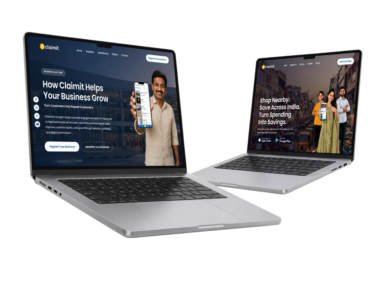
Building Landing Pages
Product value extended beyond the app.
Landing pages explain the reward model to shoppers and merchants while maintaining the same visual language.
Clear customer and merchant benefits
Simple registration and onboarding
Reward model explained visually
Campaign-ready promotional areas
After Launch Support
Launch support extended the product into brand and marketing.
After the app experience was designed, the same visual system was used to support acquisition, merchant adoption, and long-term brand consistency.
Social Media Creatives Support
Campaign-ready posts for launch and growth.
Social creatives helped explain the app value quickly across customer and merchant channels while keeping the message recognizable.
Brand Identity Support
A guideline system for consistent execution.
The brand identity document gave the team rules for logo usage, colors, typography, layouts, and promotional assets after launch.
Final Conclusion
A clearer reward journey and a system ready to grow.
Product outcome
Visible value, local relevance, reusable components, and clearer delivery.
Design outcome
A consistent experience across discovery, earning, redemption, and support.
Trust is not supporting UX. In a rewards product, trust is the product.